Work and review in the graph
Edit any item where the graph draws it, link and create items by dragging, and carry out a review in the graph, from raising findings to signing off. The app now also warns you before an edit would change someone's review.
The graph used to be somewhere you looked at your trace. In this release it becomes somewhere you work. You can edit any item where it is drawn, connect items by dragging between them, and carry out a whole review without leaving the canvas. Reviews also get a calmer workspace, and a guard against changing one by accident.
New and improved
Edit any item in the graph
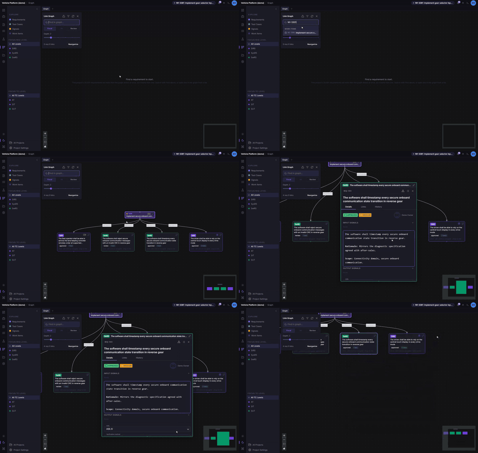
- Expanding. Every node has an expand control. It turns the node into that item’s full editor, drawn in place on the canvas: the same requirement, test case, work item or signal panel as the side panel, with every field and custom field.
- Working inside it. Typing, selecting and scrolling inside an editor never drag the node or move the canvas. Middle-drag pans the canvas, and Ctrl+wheel (⌘+wheel on a Mac) zooms it.
- Room to work. Several editors can be open at once. The graph lays itself out around them, and stays laid out that way when you switch between Focal, All and Review. Drag an editor’s bottom-right corner to resize it.
Lock the graph while you work
- The lock. The lock button above the graph keeps the view, its focus and the camera where they are. A click then only selects a node.
- Locating something. Locate in graph, or a pick from Find, zooms to the item if the locked view draws it. If it doesn’t, the graph says so and offers Unlock and show it.
- Per tab. Each view tab keeps its own lock.
Link and create by dragging
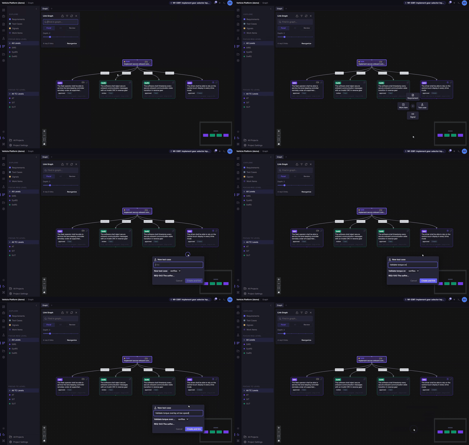
- Onto another node. Drag from one node’s handle onto another to link them. Every pair of kinds can now be linked, including signals and work items. Before you confirm, the link is shown as the sentence it stores, such as “this work item implements that requirement”.
- Onto empty canvas. A radial menu offers a new requirement, test case, signal or work item. Fill in its title and the few fields it needs, and it is created already linked, at the spot where you dropped.
See what is under review, wherever it appears
- On graph nodes. An item in an open review carries a review marker. It turns amber with a count once a finding is open on it, and red while any open finding is major. The markers update live as the review moves.
- In detail panels. Above a requirement, test case or signal, a banner names each open review the item is part of, with Open review, and lists its open findings by field.
- For everyone who can read the project, not only the reviewers, so V&V and other teams can see where a specification still has review gaps.
Review in the graph
-
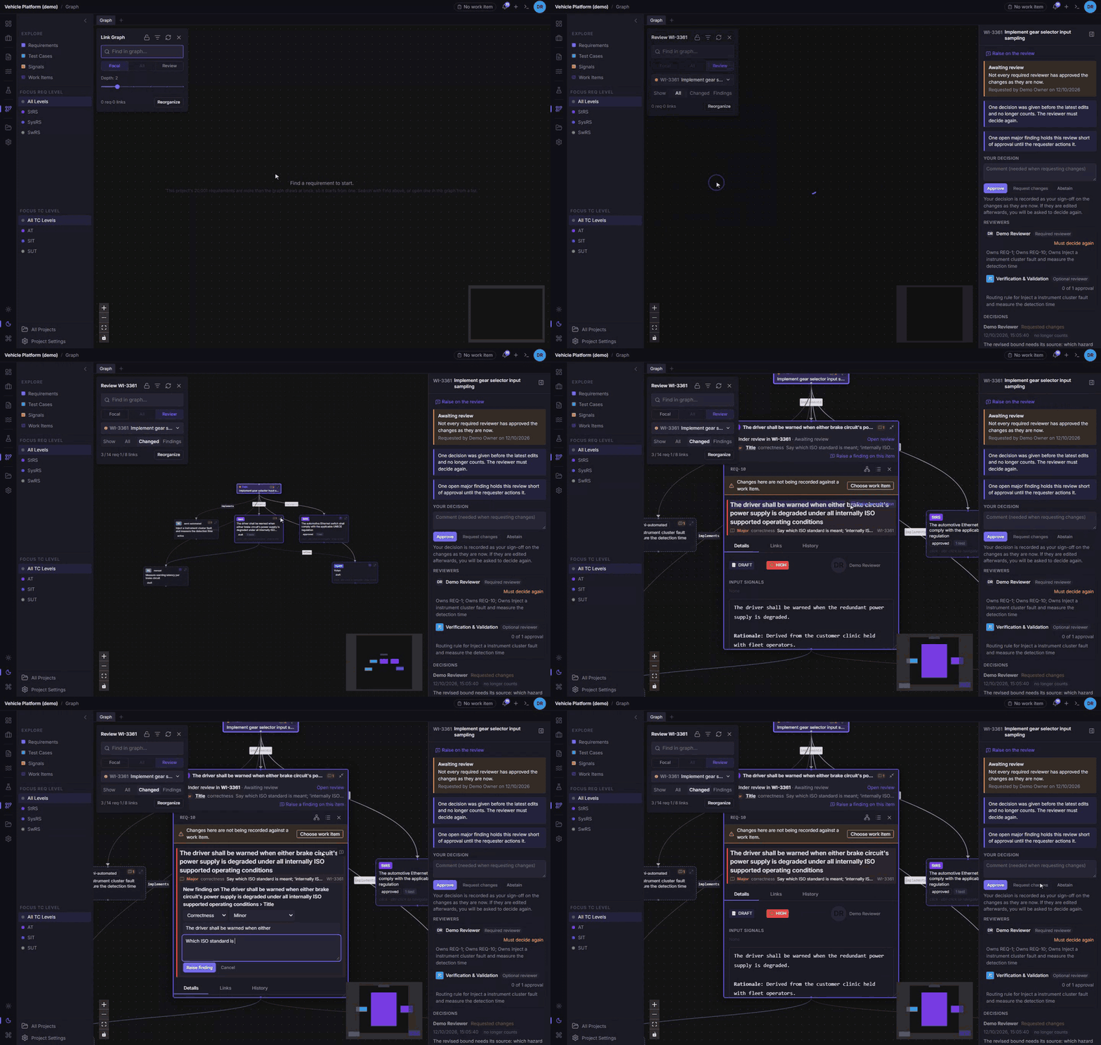
The Review view. Beside Focal and All, the graph has a Review view for one open review. It draws:
- the work item;
- everything changed under it;
- their direct neighbours, dashed, for context.
Choose the review from the graph’s panel, where your reviews are grouped as Reviewing, Requested, All mine and Everyone. Or use Open in graph from a review’s workspace.
-
Show. All, Changed (only what the work item changed) or Findings (only what has open findings).
-
The review rail. A rail beside the canvas holds the review’s state, its reviewers, Raise on the review, and your decision: approve, request changes or abstain. It collapses to a strip when you need the room.
-
Raising findings in place. In an item’s expanded editor, a reviewer can raise a finding on a field, on a selected passage (which is quoted), or on the item as a whole.
-
Read-only for reviewers. The editors stay editable for the review’s requester and the authors of its changes. For everyone else they are read-only, so a reviewer cannot change what they are reviewing.
A calmer Reviews workspace
- No tabs. The changes sit in one card, with a decision rail beside them that is always in view. It holds the review’s state and requester, your decision, the reviewers and the decision log. On a narrow screen the rail moves below the changes.
- Aligned actions. Every change row ends in the same two columns: its open-findings count, and its actions (raise a finding, open the item). They line up from row to row.
- Raising where it belongs:
- on the whole review, from the top of the changes;
- on an item, from its row;
- on a field, from an icon that appears when you hover over it;
- on a passage, by selecting it, which turns the field’s icon into Raise on selection and quotes the text.
A warning before an edit changes a review
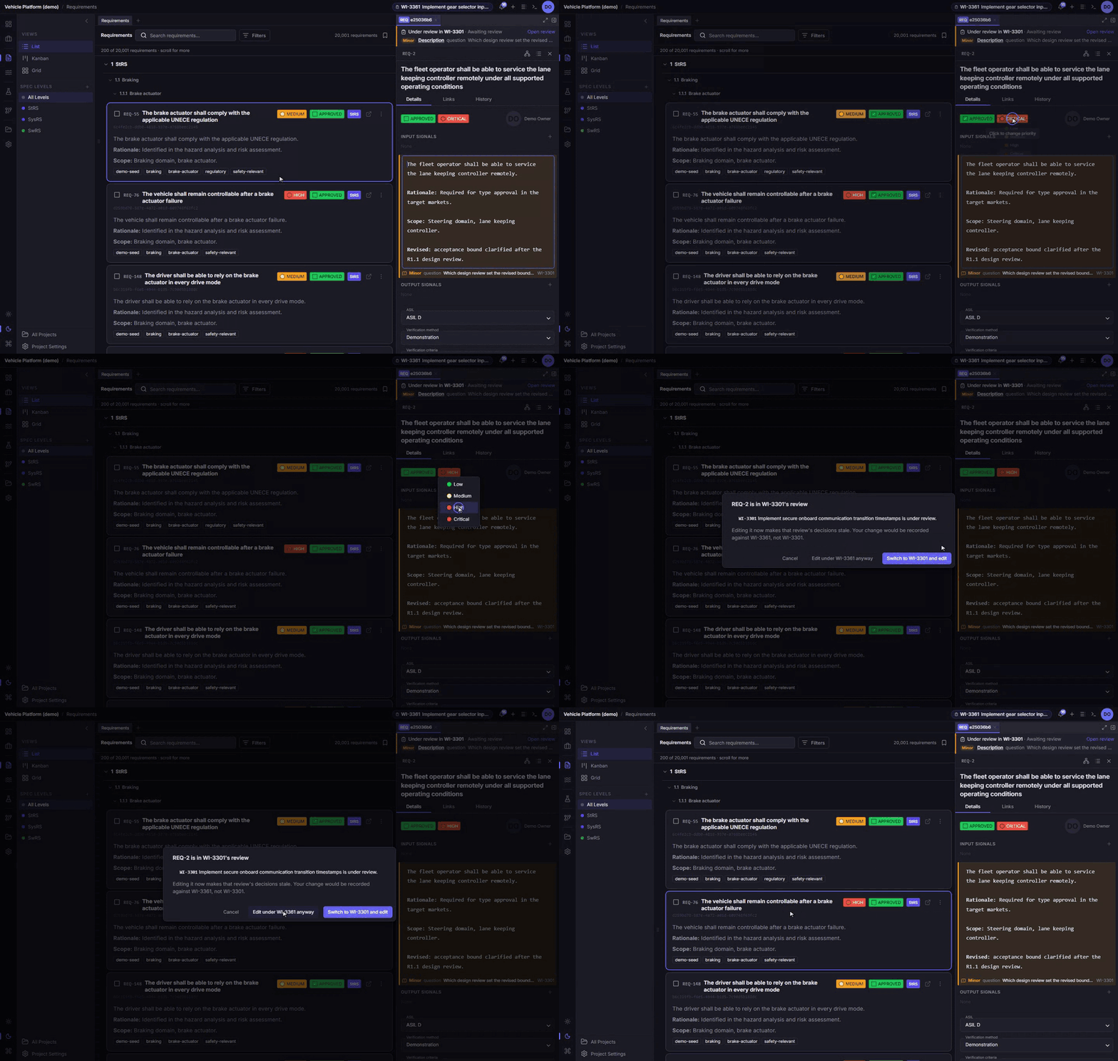
With change control on, your first edit to a requirement, test case or signal now checks whether it would change a review it shouldn’t.
- Another work item’s review. If the item is in another work item’s open review, editing it would make that review’s decisions stale, and record your change against your own work item. You can switch to that work item and edit, edit under yours anyway, or cancel.
- Your own review. If your active work item is under review and the item isn’t part of it yet, editing it would add to a change set that is already being reviewed. You can add it to the review, choose another work item from a picker in the same dialog, or cancel.
- Asked once. You are asked once per item for each work item, never on every keystroke. Cancel puts the field back as it was.
Every change is linked to its work item
A test case or signal you change under a work item is now linked to it, as requirements already were. Those already changed under a work item are linked when this release is installed, so a review’s graph draws only links that are really stored.
The graph on large projects
All draws every requirement in the project. When a project has more than the graph can draw at once (2,000 requirements), All is now disabled, with the reason shown when you point at it. With nothing focused, the graph opens on Find a requirement to start, with the cursor in Find, instead of an error. It also no longer downloads the whole project only to refuse it.
Fixed
- Long requirement titles were cut off in the side panel and in the graph’s editor. They now wrap.
- The graph’s empty-view message, such as “No requirement selected”, was hidden behind the canvas.